The present situation and reflection of China’s data news practice
In a narrow sense, data news is "a new way of news reporting based on data grabbing, mining, statistics, analysis and visual presentation." At present, data news has set off a social wave around the world, which has a profound impact on the future development direction of the press. The research and practice of data news in Chinese media and universities started late, and their cognitive and practical level is far lower than that of western media, but it has developed in full swing in recent years. Driven by the strategic idea of media convergence published by General Secretary of Supreme Leader in 2014, Gansu Integrated Media Research and Training Base held the first and second China Data News Competition and Data News Seminar in June 2015 and May 2016 respectively, which received great attention at home and abroad. Based on the comparative analysis of the works of the two competitions, this paper combs the development path of data news from five aspects and puts forward some suggestions.
Agenda setting: The China issue has changed from localization to internationalization.
In order to facilitate the comparison of works, the reporting topics are set to seven categories, namely, economy, culture, society, politics, environment, education and others. On the premise of unlimited theme, the first work received 86 data news works from academia and industry. Among them, social news (34%) is the main focus of reporting, followed by cultural news (22%) and political news (12%). In the second edition, the reporting requirements are closely combined with the "One Belt, One Road" strategic propaganda, and the use of data news to tell the story of the New Silk Road is advocated, and the government concept is interpreted for readers in a relaxed way. A total of 60 works with strong topics were received, with economic news (22%) accounting for the main reporting area, followed by cultural news (11%) and others (10%) (see Figure 1).
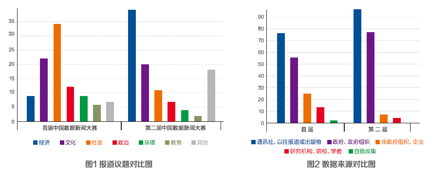
The topics of the first work are mostly news points that the global media pay close attention to in a certain period of time, such as social news such as "Tracing back to the source of PM2.5", "When I am old, am I No Country for Old Men" and cultural news such as "The Internet and us" and "Outbound travel, where to play in Chinese in 2014"; The topic of the second work is basically about the international communication of the China issue, which puts the public interest in the international context and seeks the connection between events and individuals. For example, "Where is the next world factory" predicts the next country that will become the world factory due to the demographic dividend by presenting the demographic situation of China and the countries along the Belt and Road that are directly related to the public interest.
Data quality: news transparency and value significance have been improved.
In the domestic media environment, how to seek, collect and process the complicated and disorderly but extremely important data, and use the data comparison to illustrate the problem vividly is the key point in the research and practice of data journalism, so the data quality is very important.
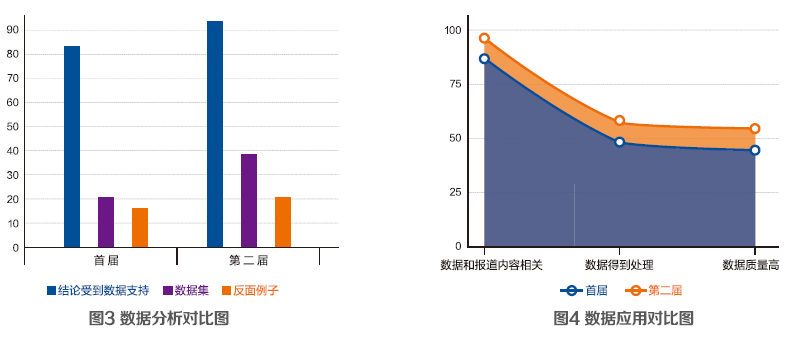
First, the data source. News agencies, previous reports or publications (data published by news agencies, previous reports or other publications), and governments and government organizations (data directly published by governments on government information disclosure websites or government reports) are all data sources for the works of the two competitions, and they show a steady upward trend. News agencies, previous reports or publications (96%), and governments and government organizations (77%) occupy a monopoly position in the second works (.
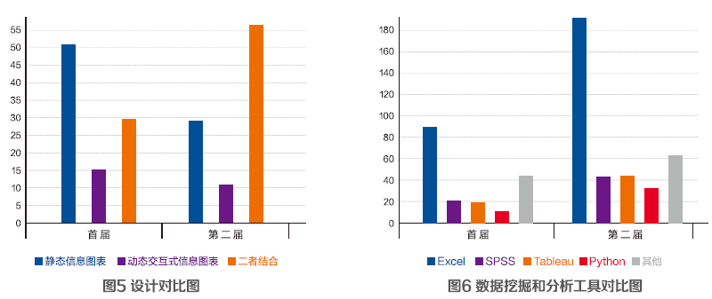
Second, data analysis. Whether the conclusion is derived from data (the conclusion is supported by data), whether the data comes from more than one source or data set, and whether it is demonstrated by comparison (negative example) become the main dimensions to test whether a data news can be deeply analyzed and interpreted. The analysis of data (conclusion received data support, data sets and negative examples) in the second work has a certain proportion higher than that in the first work (see Figure 3).
Third, data application. How to use objective and calm data analysis results to scientifically interpret the events concerned by the audience, deeply find the relevant relationships and internal logic, and highlight the intrinsic value of data is the key to the proper application of data. In the two works, the correlation between data and report content is high, accounting for 87% and 96% respectively; In data processing, the ability of the second session (57%) to process data is slightly higher than that of the first session (48%); In terms of overall data quality, the data transparency and credibility of the second edition (54%) are slightly higher than that of the first edition (44%) (see Figure 4).
Fourth, data performance. The expression of data is directly related to the user’s understanding of data news works. According to statistical analysis, the proportion of visualization in the first and second works is 84% and 89% respectively. Visualization means that the visual design of data news can be understood at a glance. For example, visualization includes related descriptive words (clear titles in horizontal and vertical axes), no spelling mistakes, consistent fonts, correct units, etc.
Design presentation: the way tends to be diversified and interactive.
Compared with traditional news reports, data news in the era of big data pays more and more attention to the interactivity of layout design and the expression of creativity. The information and perspectives it receives can be defined by the audience themselves, bringing the audience into the news, and the autonomy and individuality of the audience are realized and respected. At the same time, it improves the accuracy of news reports and presents the whole picture for the audience as much as possible. According to statistics, the first work was mainly composed of static infographics (53%), while the second work was mainly composed of static infographics and dynamic interactive infographics (59%) (see Figure 5).
For example, in the first work, "Tracing back to the source of PM2.5" and "Where did you go to play in Chinese in 2014" mainly presented the data relationship through concise and clear infographics, and outlined the content to be expressed. In the second work, "Counting the Steel Silk Road: the China-Europe Railway connecting Asia and Europe" is presented visually mainly in the form of two large maps, using the magic mirror as a visual data analysis platform, and presenting different data values with various charts that conform to the characteristics of the data itself.
Technology application: news business is more refined.
The first is data mining and analysis tools. The exploration and practice of data news requires that unknown and valuable information and knowledge can be excavated from a large number of data by means of statistics, artificial intelligence and machine learning. The first works are mainly Excel(85%), Others (41%), SPSS(19%) and Tableau(18%), while the second works are mainly Excel(98%), Tableau(23%), SPSS(21%) and Python(21%). Among them, other data mining tools mainly include R language, orange, Mahout, import.io, octopus, etc. (see Figure 6). It can be seen that data news producers use a variety of data mining tools, and the proportion of Excel, Tableau and Python has increased.
Followed by data visualization tools. Compared with traditional news, the visualization of data news is presented to users in the form of visual and interesting information charts through massive complex data and related information such as geography or time, and it is abstracted into concrete. The first works were mainly visualized by other tools (68%), Photoshop(51%) and Baidu Illustration (39%), while the second works were more visualized by other tools (46%), Photoshop(45%) and Echarts(36%).
Narrative style: the ability to tell stories needs to be improved.
Simon Rogers, editor of the Guardian data blog, believes that "data news is not a graphic or visual effect, but the best way to tell stories, but sometimes stories are told with visual effects or maps." According to statistics, the ability of the first work (23%) to tell news stories through big data is slightly better than that of the second work (19%), but it cannot be ignored that there is still a lot of room for improvement in how to choose the best angle to present data, the correlation between audiences and the story-telling of the most valuable news.
In the first wORk, "How did the ancients escape the summer?" "If this is not love, my mother is so sad." "Buying a house or trading stocks" presents the relationship between boring data and the audience in the form of interesting stories, which has achieved good communication effects. In the second work, "Counting Dunhuang" tells the artistic story of Dunhuang silk through big data, which combines humanistic storytelling with science and has certain pioneering significance.
Deficiency and reflection: five suggestions to promote the better development of data news
First of all, from the choice of topics, although the focus of data news has gradually expanded to be more in line with the world, based on the country and looking at the world, the most crucial thing is how to find the connection between events and audience individuals in the choice of topics, that is, news transparency.
Secondly, from the perspective of data quality, data is not only a resource of data news, but also a tool for data news expression. Therefore, data news calls for open data sets to enhance credibility. In addition, producers need to actively involve the audience with the concept of open source.
Third, from the design point of view, producers can use a variety of design methods (exquisite charts, dynamic maps, schematic diagrams, explanatory illustrations), but one thing that cannot be ignored is whether the information conveyed to the audience is accurate. Therefore, in addition to design, there is also a key step in creating charts-to ensure that the information provided to the public is accurate.
Fourthly, from the perspective of technology application, with the help of audio, video, images and other visual AIDS, data news works maximize the integration of the audience’s senses and enhance the audience’s immersion experience. Therefore, compound talents and teamwork have become essential elements for data news to gain extensive wisdom and technical support and inject mature and high-quality content.
Fifth, in terms of narrative mode, in the era of big data, data visualization is only a tool to realize news narration, and the most crucial thing lies in the news story itself and its internal logical structure. How to make the audience know the news facts more deeply requires producers to constantly explore the deep and valuable news stories, enhance the personal experience of users, and avoid giving people the illusion of fragmentation and fast food. (Text/Chen Jiyin Liu Yingqi)